Tables in Glamour, our markdown renderer, got a big makeover in v0.10.0 last week with UX improvements for screen reader compatibility and general legibility. Here’s a little sneak peek of the process.
How it Started
Okay, so here’s what tables with a bunch of links used to look like: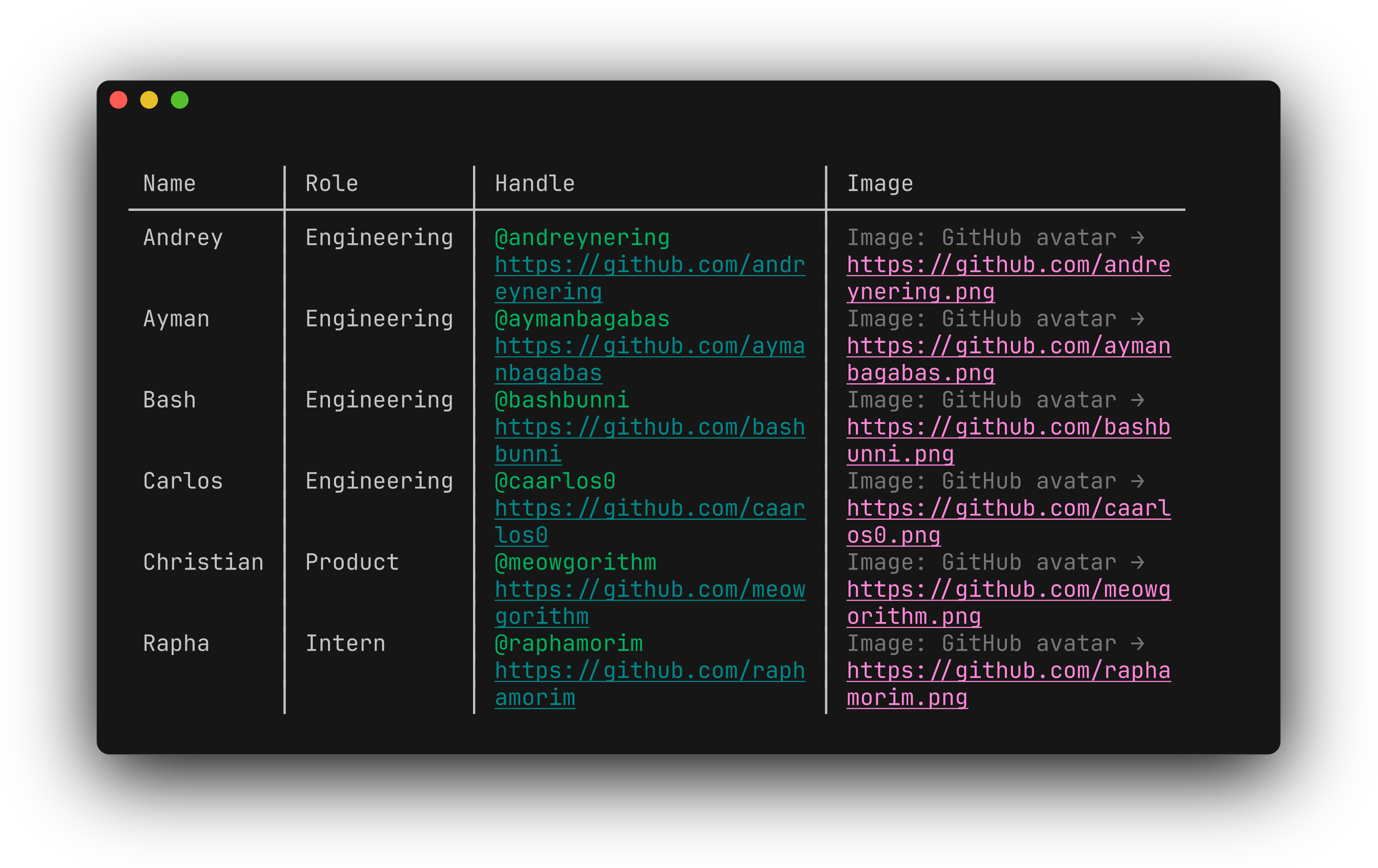
While working with the GitHub CLI team, we received feedback that links were interrupting the flow of text, which really hurt accessibility and just made tables really hard to read. They were also spanning multiple lines when they would wrap, making them impossible to click. We realized we had a nice opportunity to improve table rendering in the terminal in a big way.
How it’s Going
Rethinking how we were rendering links was the perfect opportunity to fix
broken links, text legibility, AND improve accessibility in one fell
swoop. After much consideration, we removed the URL from the table and instead
opted to show it below instead.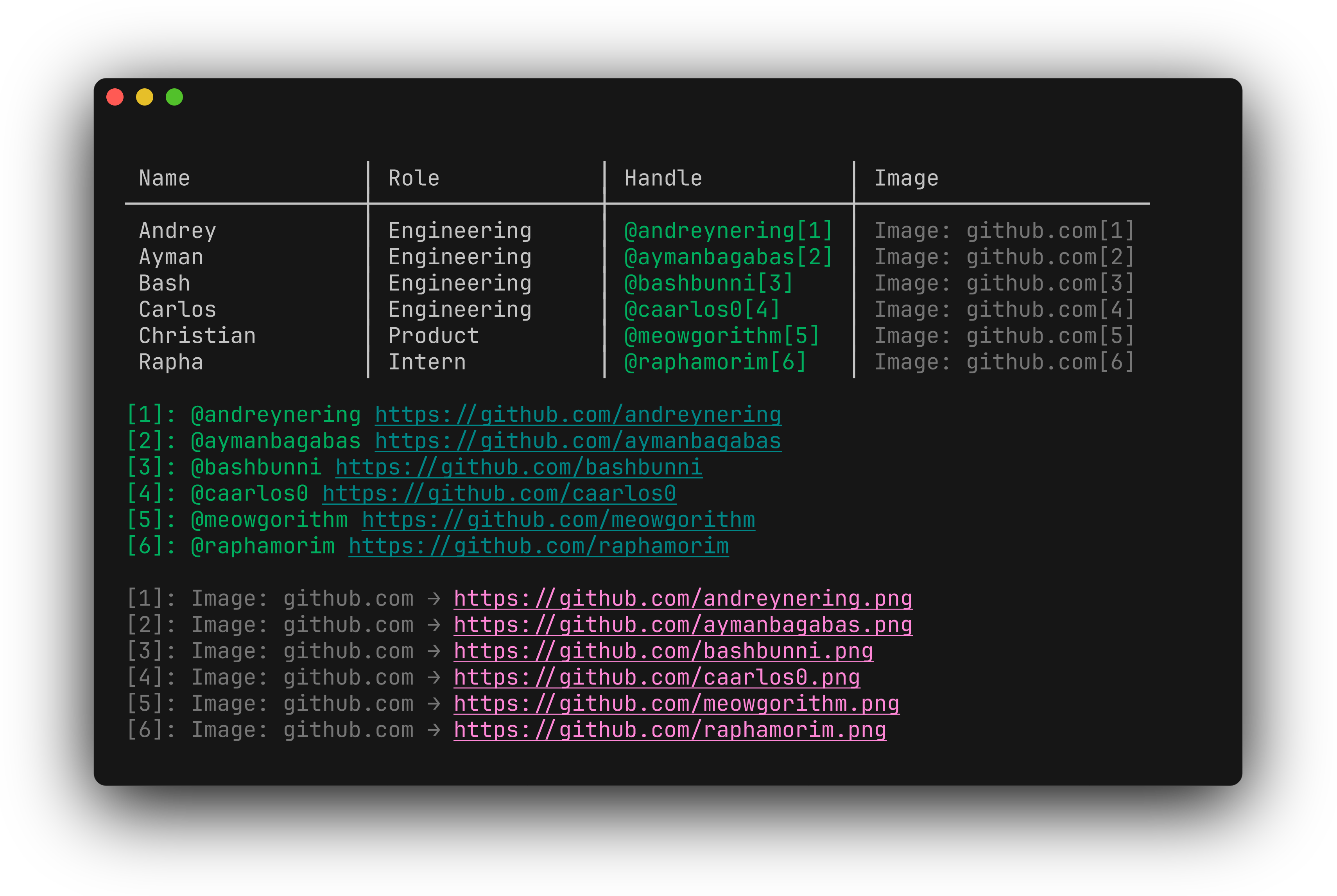
A big thank you to Andy, William and Kynan on the GitHub CLI team for working with us in this redesign, and a big shout out to Andrey Nering here on the Charm team who absolutely crushed this release, from design to implementation. 💫
A GitHub Bonus
As a little bonus we also improved rendering for GitHub URLs, inspired by our
friends at GitHub. Check it out: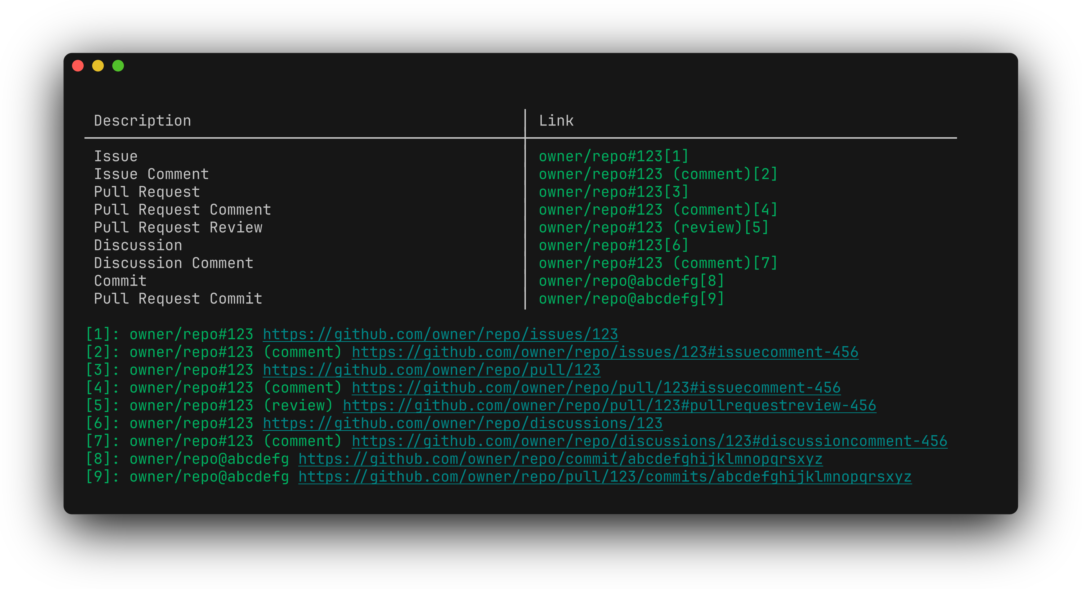
Hungry for more?
Want all the details on this release? Then you’ll want to read the full release notes on Glamour v0.10.0.
Whatcha think?
Have some feedback on this post? We’d love to hear. Let us know in Discord or via email at vt100@charm.sh.